Mixing Wood Tones in Furniture: Professional Rules of Thumb
Reading time: 14 minutes
Walk into almost any professionally designed living room in 2026, and you’ll notice something that might surprise you: the furniture rarely matches. Not perfectly, anyway. That oak coffee table sits beside a walnut bookshelf. A light maple dining chair pulls up to a darker teak table. And somehow, it all looks intentional. That’s because it is.
Mixing wood tones is one of the most misunderstood—and most rewarding—skills in interior design. Many homeowners avoid it entirely, defaulting to “matchy-matchy” furniture sets that feel flat and uninspired. Others dive in without a plan and end up with rooms that look chaotic rather than curated. The good news? There’s a middle path, guided by a handful of professional rules of thumb that transform the process from guesswork into genuine design strategy.
Whether you’re furnishing a new home, refreshing a living room, or simply trying to figure out if that vintage credenza will work alongside your new sofa table, this guide has you covered. Let’s turn the complexity of wood-tone mixing into your biggest decorating advantage.
Table of Contents
- Why Mixing Wood Tones Matters More Than Ever
- Understanding Wood Undertones: The Foundation of Everything
- The Core Professional Rules of Thumb
- Common Challenges and How to Overcome Them
- Real-World Case Studies: What Works and Why
- Wood Tone Compatibility: A Visual Guide
- Comparing Popular Wood Species: A Quick Reference
- Frequently Asked Questions
- Your Wood-Mixing Playbook: Next Steps
Why Mixing Wood Tones Matters More Than Ever
Interior design trends in 2026 have moved decisively away from the cookie-cutter matching furniture sets that dominated big-box retail for decades. According to a 2025 Houzz & Home Design Report, 68% of homeowners who renovated their spaces in 2025 deliberately incorporated mixed wood tones, up from just 41% in 2020. This shift reflects a broader cultural appetite for spaces that feel personal, layered, and authentic—rather than assembled straight from a showroom floor.
Part of this shift is practical. With supply chain disruptions still influencing furniture availability, and with more people investing in secondhand, vintage, and heirloom pieces, the ability to mix wood tones is no longer just an aesthetic preference—it’s a functional necessity. You can’t always source a perfect match. But you can build a cohesive room from disparate pieces if you understand the underlying principles.
Beyond trends, there’s a timeless design truth at play: rooms that feel lived-in, curated over time, and full of character almost always feature mixed materials. The most beautiful interiors in Architectural Digest, Elle Decor, and Dezeen in 2026 are not monochromatic wood showcases. They’re carefully orchestrated mixtures. The professionals making those rooms look effortless are following specific rules—rules you’re about to learn.
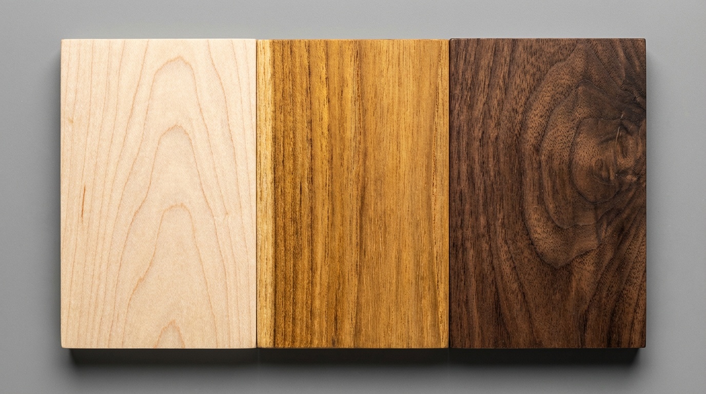
Understanding Wood Undertones: The Foundation of Everything
Before you can mix wood tones successfully, you need to understand what you’re actually mixing. Wood isn’t just “light” or “dark.” Every species carries an undertone—a secondary color that influences how it interacts with other materials in a room.
The Three Primary Wood Undertone Categories
Professional designers typically organize wood undertones into three broad categories:
- Warm Undertones: Reds, oranges, yellows, and golden hues. Think cherry, mahogany, tigerwood, and honey oak. These woods feel inviting and energetic, and they pair naturally with amber, terracotta, and cream tones.
- Cool Undertones: Grays, blues, and purples. Think ash, driftwood-finished maple, certain ebonized woods, and some maples. These woods read as calm and contemporary, pairing well with whites, navy, and stone tones.
- Neutral Undertones: Browns that sit between warm and cool—neither strongly orange nor strongly gray. Walnut, teak, and certain oaks fall here. These are the “chameleons” of the wood world, capable of bridging warm and cool tones beautifully.
Why Undertones Trump Shade Every Time
Here’s the insight most beginners miss: shade (light vs. dark) matters less than undertone alignment. A pale, bleached ash and a deep espresso walnut can actually work together beautifully because both have neutral-to-cool undertones. Meanwhile, a medium-toned oak and a medium-toned cherry—nearly identical in value—can clash violently because one is warm-orange and the other is warm-red.
Interior designer Claire Jukes, whose London-based studio Jukes & Morrow was named among Dezeen’s Top 25 Studios of 2025, puts it this way: “When my clients ask whether two woods go together, I stop them from looking at the samples side by side and ask them to look at the samples against a neutral gray card. That’s where you see the true undertone conversation happening.”
The practical takeaway: before bringing any two wood pieces together, hold fabric swatches or paint chips next to each one separately. Note what color it makes you think of. If both woods evoke the same feeling—both feel autumnal and warm, or both feel cool and Scandinavian—they’re likely compatible regardless of their shade difference.
The Core Professional Rules of Thumb
These aren’t rigid laws—they’re battle-tested principles that designers return to again and again because they work. Think of them as your framework, not your cage.
Rule 1: The Three-Tone Maximum
Professional designers almost universally recommend limiting a room to three distinct wood tones at most. Going beyond three creates visual noise that reads as disorganized rather than eclectic. Within your three tones, aim for one dominant, one secondary, and one accent:
- Dominant tone (60%): Your largest wood element—typically flooring, a large dining table, or a statement shelving unit.
- Secondary tone (30%): Your next largest piece—a sofa table, sideboard, or bed frame.
- Accent tone (10%): Small touches—a decorative tray, a picture frame, a small side table, or wooden accessories.
This 60/30/10 wood distribution mirrors the classic interior design color rule and works for the same reason: it creates hierarchy and visual order that the eye instinctively finds satisfying.
Rule 2: Vary Shade, Respect Undertone
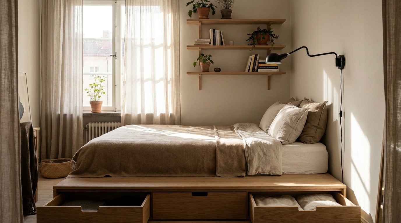
The single most reliable rule of professional wood mixing: keep undertones aligned, but vary shade dramatically. A room that pairs a light blonde wood with a very dark wood of the same undertone family looks intentional and sophisticated. A room that pairs two medium-toned woods with clashing undertones looks like an accident.
This is why walnut and white oak is one of the most celebrated pairings of the 2020s—and remains so in 2026. Walnut’s dark, neutral-cool brown and white oak’s pale, neutral-warm beige are quite different in value, but neither screams “orange” or “gray,” so they harmonize beautifully. The contrast provides visual interest; the shared neutrality provides coherence.
Rule 3: Use a Bridge Element
When mixing two woods that are somewhat tonally different—say, a warm pine and a cooler teak—introduce a bridge element that borrows characteristics from both. This might be:
- A textile (rug, cushions, curtains) in a color that appears in both woods
- A metal finish in a warm brass or bronze that reads between the two tones
- A painted element (wall color or cabinetry) that relates to the shared undertone
- A third wood that sits tonally between the two
Think of the bridge element as an interpreter. When two woods speak different dialects, you need something in the room that speaks both languages—connecting them visually and preventing the eye from reading them as a mismatch.
Rule 4: Ground the Room with Flooring
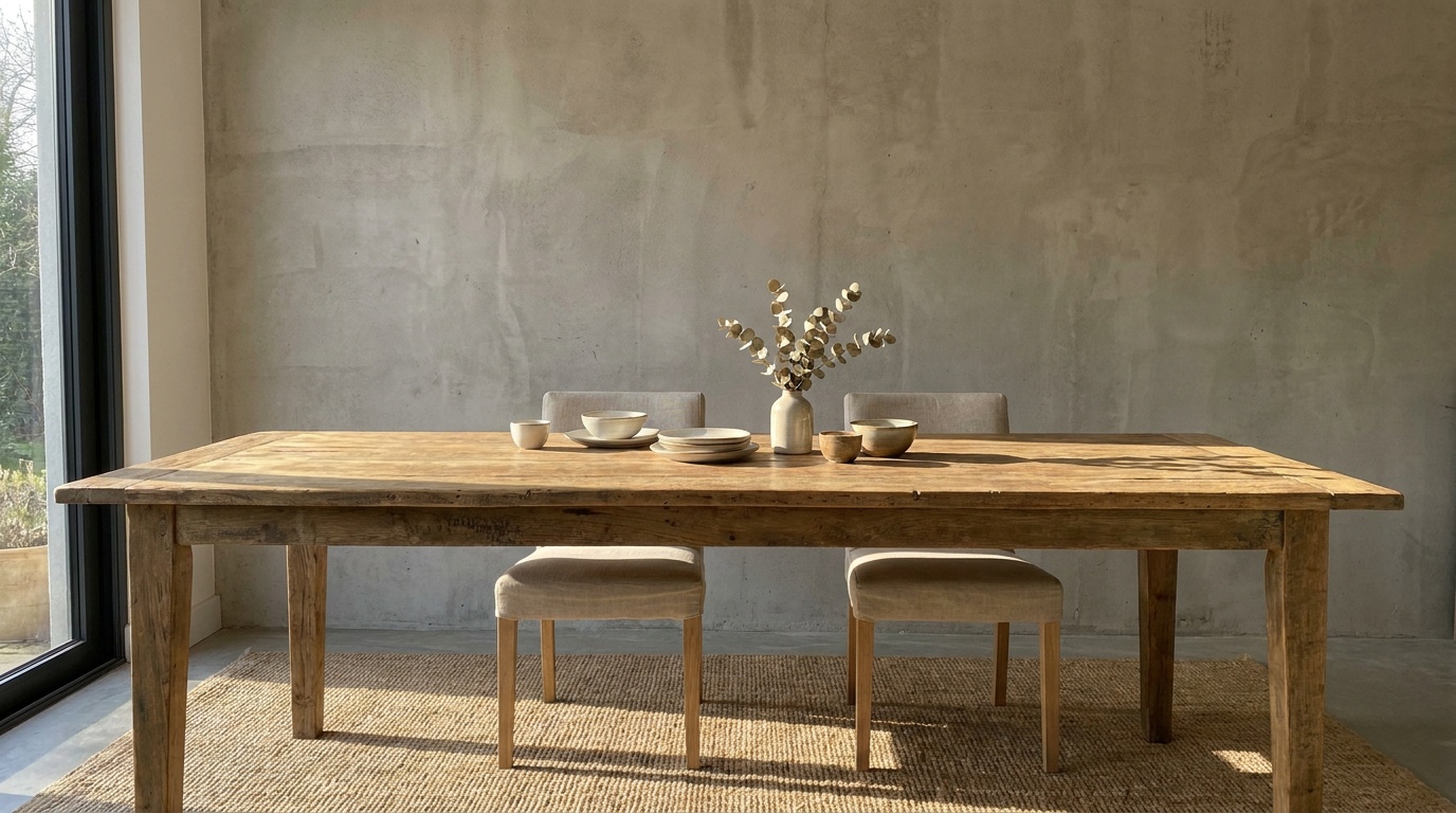
Your flooring is almost always your dominant wood tone—and it sets the undertone baseline for everything that follows. Whatever you put on the floor, your furniture must acknowledge it. This doesn’t mean matching it; it means responding to it. If your floor is warm red-oak, your furniture should either align with that warmth or contrast it with a specifically different tone, tied together with a bridge element. Ignoring the floor entirely is the most common and most costly mistake in wood mixing.
Pro Tip: If you’re installing new flooring, choose it after identifying the key furniture pieces you love and plan to keep. Too many homeowners do the reverse, then struggle forever to find furniture that harmonizes with floors they can’t change.
Rule 5: Distance Creates Harmony
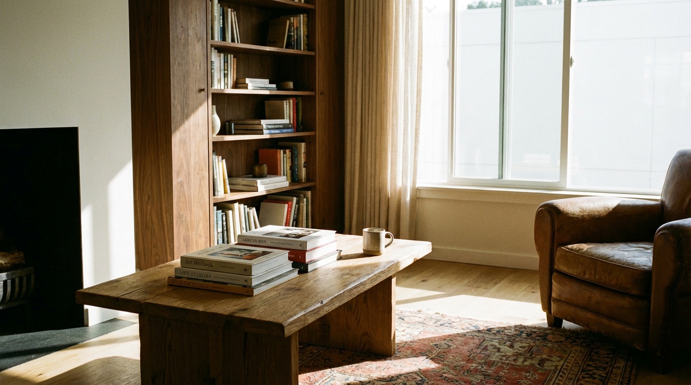
Two wood tones that look jarring side by side can look perfectly composed when separated by space or other materials. Proximity amplifies contrast. A warm oak floor and a cool ebonized side table will look striking if the side table sits on a wool rug—the rug physically and visually separates them. Place that same table directly on the floor with nothing between, and the contrast becomes harder to read as intentional.
This is why area rugs are one of the most powerful tools in wood-tone mixing. They’re not just decorative; they’re optical separators that give your eye a rest between competing tones.
Common Challenges and How to Overcome Them
Even with the rules in hand, certain situations trip up both beginners and experienced decorators. Here are the three most common challenges—and the professional solutions.
Challenge 1: The Inherited Piece Problem
You’ve inherited a beautiful grandmother’s oak sideboard—warm, honey-toned, heavily grained. Your current furniture skews cool and contemporary. How do you integrate it without the room looking like a time-travel accident?
Solution: Lean into contrast deliberately and anchor it with textiles. Paint the wall behind the sideboard in a warm off-white or warm greige—this draws the eye to the piece as a focal point rather than an outlier. Style the top of the sideboard with objects that bridge your two worlds: a cool-toned ceramic vase, a linen runner in warm cream, a small black-framed mirror. You’re essentially building a little stage around the inherited piece that translates it into your current aesthetic. The key is that the curation around the piece does the work of visual mediation.
Challenge 2: The Flooring Mismatch
You’re renting, or you’ve moved into a home with flooring you can’t change—say, a strong orange-toned red oak—and you want a contemporary, cool-toned furniture palette. This is one of the most common design predicaments in 2026, especially in the UK, where hardwood floors in Victorian and Edwardian properties are often a fixed feature.
Solution: Cover generously and contrast specifically. A large, low-pile area rug in a cool gray, cream, or charcoal effectively “replaces” the floor visually in your main seating area. Within that newly defined space, you can introduce cool-toned furniture freely. The key is to choose one piece of furniture—perhaps a console table or a floating shelf—that matches the warm orange-oak floor tone. This creates the impression that the warm floor and cool furniture are in dialogue rather than conflict.
Challenge 3: The “Safe Beige” Trap
In an effort to avoid clashing, many homeowners gravitate toward a sea of medium-toned, neutral beige woods—light oak everywhere, slightly different but never bold. The result is rooms that feel safe to the point of blandness: no drama, no depth, no personality. A 2025 survey by the UK’s House Beautiful magazine found that 54% of respondents described their own living rooms as “inoffensive but uninspiring”—a direct symptom of tone-matching anxiety.
Solution: Embrace intentional contrast. The antidote to the safe beige trap is to commit to at least one wood piece that is dramatically different from the others—either much darker or with a genuinely different undertone. A room full of light oak furniture instantly comes alive when a deep walnut coffee table is introduced. The contrast gives the eye somewhere to go and transforms the palette from monotonous to curated.
Real-World Case Studies: What Works and Why
Case Study 1: The Brooklyn Loft Mix (2025)
Interior firm Atelier Noe completed a Brooklyn loft renovation in late 2025 that became widely shared on design platforms for its masterful wood mixing. The space featured: original wide-plank pine floors (warm, golden), a massive dining table in dark walnut (cool-neutral, deep), open-shelving in whitewashed ash (pale, cool), and a vintage mid-century teak credenza (warm-neutral, medium).
On paper, that sounds like chaos. In practice, it was extraordinary. Here’s why it worked:
- The warm pine floor and warm teak credenza anchored the room with warmth.
- The dark walnut table provided dramatic contrast in value without clashing in undertone (walnut is neutral enough to read alongside both warm and cool tones).
- The whitewashed ash shelving was effectively “neutral” due to its bleached finish, removing its undertone from the equation entirely.
- A large, abstract wool rug in rust and cream physically bridged the floor and the furniture zone, tying warm and cool together.
The three-tone rule was respected: pine/teak (warm), walnut (dark neutral), and ash (pale neutral). The bridge was the rug. The result: a room that looked like it had been assembled over fifteen years rather than in six weeks.
Case Study 2: The Scandinavian Apartment in Stockholm (2026)
A 2026 project by Stockholm-based designer Lena Björk demonstrated how wood mixing works at the lighter, cooler end of the spectrum. Working with a compact 65-square-meter apartment, Björk introduced: light birch flooring (pale, slightly warm), a dining table in white-pigmented oak (very pale, neutral), a reading chair with a frame in smoked oak (medium gray-brown, cool), and a bedroom wardrobe in untreated pine (warm, golden).
The risk here was that pale-on-pale would feel flat. Björk prevented this by ensuring dramatic textural variation—the birch floors had prominent grain, the white-pigmented oak table was smooth and clean-lined, and the smoked oak chair had a brushed finish that caught light differently at every angle. Texture became the mixing tool when tone variation wasn’t dramatic enough on its own. The lesson: when shade contrast is subtle, surface texture can carry the differentiation.
Wood Tone Compatibility: A Visual Guide
The chart below illustrates the design compatibility of common wood pairings on a scale of 1–10, based on professional consensus and undertone alignment principles.
Wood Pairing Compatibility Ratings (Out of 10)
Ratings based on undertone alignment, shade contrast, and professional design consensus. Higher scores indicate easier, more forgiving pairings.
Comparing Popular Wood Species: A Quick Reference
| Wood Species | Undertone | Shade Range | Best Paired With | Avoid Pairing With |
|---|---|---|---|---|
| Walnut | Neutral/Cool | Medium to Very Dark | White oak, ash, maple | Cherry, red mahogany |
| White Oak | Warm/Neutral | Light to Medium | Walnut, teak, ebonized woods | Heavily orange-toned cherry |
| Cherry | Warm/Red | Light to Medium-Dark | Mahogany, dark walnut (with bridging) | Ash, cool maple, pine |
| Teak | Warm/Neutral | Medium to Medium-Dark | Ash, light pine, white oak | Red oak, pure gray-washed woods |
| Pine | Warm/Yellow | Very Light to Light | Dark walnut, ebonized oak, raw steel | Cherry, red oak, orange-toned woods |
Frequently Asked Questions
Can I mix wood tones in a small room without it feeling overwhelming?
Absolutely—and in fact, thoughtful wood mixing can make small rooms feel more intentional and less like a furniture showroom. The key in compact spaces is to limit yourself to two tones rather than three, and to ensure one of them is very light or very neutral. In a small room, a pale blonde wood paired with one dark accent piece creates depth without crowding the visual field. Avoid placing two strongly contrasting tones directly adjacent to each other in tight spaces; use rugs or furniture arrangement to create physical distance between competing tones.
How do I know if a wood I already own has a warm or cool undertone?
The simplest professional trick is the “white card test.” Hold a piece of bright white printer paper next to your wood piece and look at what color the wood seems to “lean toward” in contrast. If it looks more orange, golden, or reddish against the white, it has warm undertones. If it looks more gray, taupe, or beige, it has cool undertones. If it looks like a pure medium brown with no directional pull, it’s neutral—which means it’s very versatile and will work with both warm and cool partners. You can also hold it under different light sources: LED daylight bulbs (cool) and incandescent or warm LED bulbs will accentuate different undertones.
Should my wood furniture always match my wood flooring?
No—and matching them exactly is actually one of the most common design mistakes. When furniture perfectly matches flooring, the result is a flat, monochromatic effect that makes the furniture seem to disappear into the floor rather than anchor the room. Instead, aim for a harmonious contrast: same undertone family, but clearly different in shade. A light oak floor pairs beautifully with medium walnut furniture precisely because you can see where the floor ends and the furniture begins. If perfect matching is unavoidable (perhaps due to built-in cabinetry), use rugs, textiles, and other materials to visually “break” the uniformity and add depth to the space.
Your Wood-Mixing Playbook: Next Steps
You now have the framework that professional designers use to turn a room full of mismatched wood into a space that looks deliberately, beautifully curated. Here’s how to put it into action immediately:
- Step 1 – Audit what you have. Walk through your rooms and identify the undertone of every existing wood piece. Warm, cool, or neutral? Write it down. This becomes your baseline palette.
- Step 2 – Identify your dominant tone. What’s the largest wood surface in the room? Usually the floor. That’s your anchor. Everything else needs to acknowledge it—not match it.
- Step 3 – Choose your secondary and accent tones with intentional shade contrast but aligned (or deliberately bridged) undertones. Use the comparison table in this article as your starting reference.
- Step 4 – Find your bridge element. Before making any purchase, identify what textile, metal finish, or paint color will translate between your wood tones. A rug is usually the fastest, most reversible option.
- Step 5 – Test before committing. Bring sample boards or photos of furniture into the actual room. Look at them in morning light, afternoon light, and evening lamp light. Wood looks dramatically different across lighting conditions—and what you see in a showroom or online photo may not reflect what you get at home.
In 2026, the most compelling interiors are not the ones with the most expensive pieces—they’re the ones where every piece looks like it was chosen, not just placed. Mastering wood-tone mixing is one of the fastest ways to elevate a room from functional to genuinely beautiful, and the rules in this guide give you the confidence to make bold choices without costly mistakes.
As sustainable and secondhand furniture buying continues to grow—projected to represent over 35% of all furniture purchases globally by 2027—the skill of mixing what you find with what you have becomes not just an aesthetic advantage but an environmental and economic one too.
So here’s your challenge: look around the room you’re sitting in right now. Can you name the undertone of every wood surface? If not, that’s your starting point—and the beginning of a genuinely more beautiful home.
Article reviewed by Tom Schuster, Roofing & Water Damage Rehabilitation Expert, on May 4, 2026