The Perfect Paint Color Palette for an Open-Plan Home
Reading time: 14 minutes
Ever stared at a paint swatch for twenty minutes, completely paralyzed by indecision? In an open-plan home, that moment of overwhelm is completely justified — because the stakes are much higher than in a single room. One wrong color decision can visually chop your beautiful flowing space into awkward, disconnected zones. The right palette, though? It creates a home that feels intentional, expansive, and deeply livable.
Here’s the straight talk: Choosing paint colors for an open-plan home isn’t just about picking shades you love. It’s about understanding flow, light, proportion, and psychological impact — then applying that knowledge strategically across connected spaces.
Whether you’ve just knocked down a wall between your kitchen and living room, or you’re moving into a loft-style apartment that’s entirely open-concept, this guide will walk you through everything you need to create a cohesive, stunning color palette that works with your architecture rather than against it.
Table of Contents
- Why Open-Plan Spaces Demand a Different Approach
- The 60-30-10 Rule: Your Color Proportion Framework
- Flow Strategies: Creating Zones Without Walls
- Natural Light, Undertones, and the Big Mistakes to Avoid
- Top Color Palettes Trending in 2026
- Real Home Case Studies: What Worked and What Didn’t
- Palette Comparison: Which Style Suits Your Home?
- Designer Popularity Chart: 2026 Open-Plan Color Trends
- Frequently Asked Questions
- Your Color Confidence Roadmap: Next Steps
Why Open-Plan Spaces Demand a Different Approach
Open-plan living has dominated residential design for over a decade, but in 2026, it’s evolving. According to a 2025 Houzz Renovation Trends Report, 67% of homeowners who renovated in the past two years chose to either create or expand an open-plan layout. Simultaneously, a growing movement toward “soft zoning” — creating visual distinctions within open spaces without physical barriers — has pushed color strategy to the forefront of interior design conversations.
The fundamental challenge is this: in a traditional room, your color choice affects only that space. In an open-plan home, every color you choose is in constant dialogue with every adjacent color. When you stand in your kitchen, you see the living area. When you’re dining, you see the kitchen and the lounge simultaneously. Every hue, tone, and finish is visible from multiple vantage points at once.
This creates three core challenges that a thoughtful palette must solve:
- Visual cohesion: The space should feel intentionally designed, not randomly assembled.
- Zone differentiation: Distinct functional areas (cooking, eating, relaxing) should feel subtly separate even without walls.
- Scale management: Colors can make large spaces feel cavernous or cozy — and the wrong choice amplifies rather than corrects the problem.
Interior designer Joanna Kwon, principal at Studio Kwon in Chicago, explains it well: “In open-plan design, your paint choices are essentially your architecture. Color is doing the work that walls used to do.”
The Psychology of Color in Connected Spaces
Color psychology becomes especially critical in open-plan homes because different zones of the home serve entirely different emotional functions. Your kitchen is a high-energy, task-oriented space. Your living room should invite relaxation and conversation. Your dining area bridges both worlds. The palette you choose needs to honor these psychological needs while still looking unified.
Research published in the Journal of Environmental Psychology (2024) found that spaces with harmonious color transitions — where hues share similar undertones or belong to the same tonal family — were rated 43% more “calming” and “livable” by occupants compared to spaces with abrupt color contrasts between connected zones. The science confirms what great designers have always known intuitively: transitions matter as much as the colors themselves.
Common Mistakes That Derail Open-Plan Palettes
Before diving into solutions, let’s name the patterns that consistently go wrong:
- Treating each zone as a separate room: Painting the kitchen a bold cobalt and the adjacent living room a warm terracotta creates visual chaos when seen together.
- Ignoring undertones: A “warm white” next to a “cool white” creates an uncomfortable contrast that’s hard to diagnose but impossible to ignore.
- Over-neutralizing: An entirely greige (grey-beige) palette avoids color conflict but creates a flat, lifeless space that lacks personality.
- Forgetting the ceiling: The fifth wall is often overlooked in open-plan homes, where a single ceiling spans multiple zones and requires a deliberate decision.
The 60-30-10 Rule: Your Color Proportion Framework
If there’s one tool that transforms amateur color choices into professional-looking palettes, it’s the 60-30-10 rule. This principle, long used by interior designers and visual artists, defines how to distribute color across a space to achieve balance without monotony.
Here’s how it breaks down for open-plan homes:
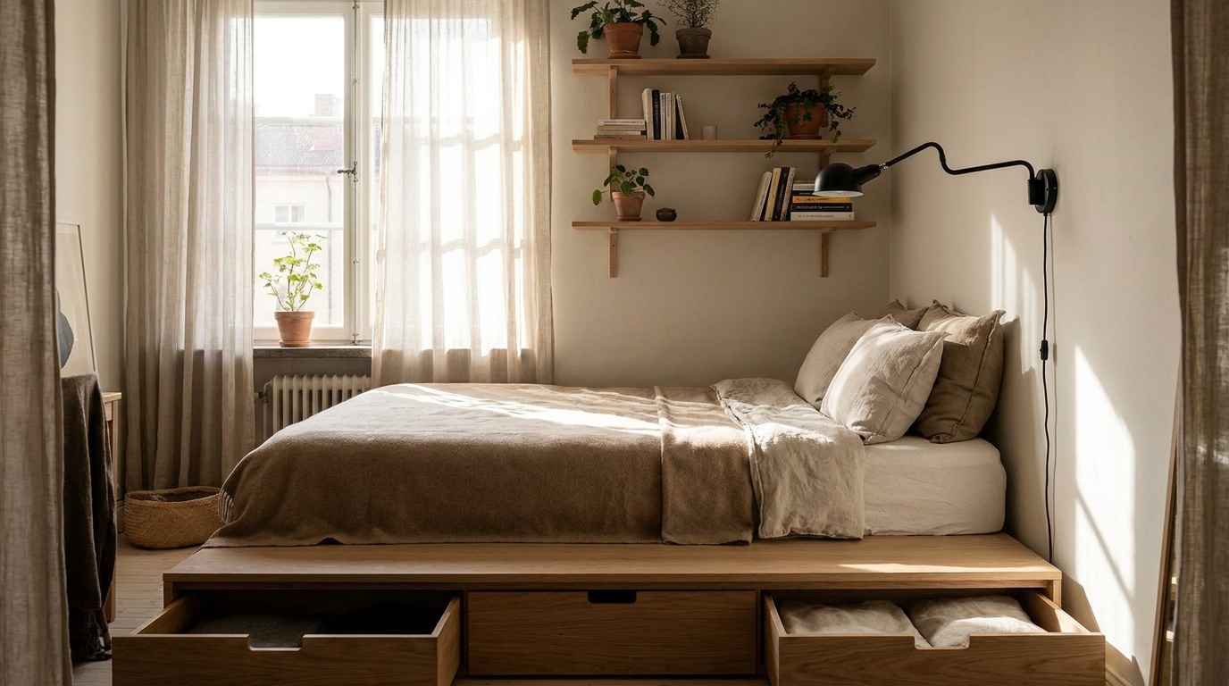
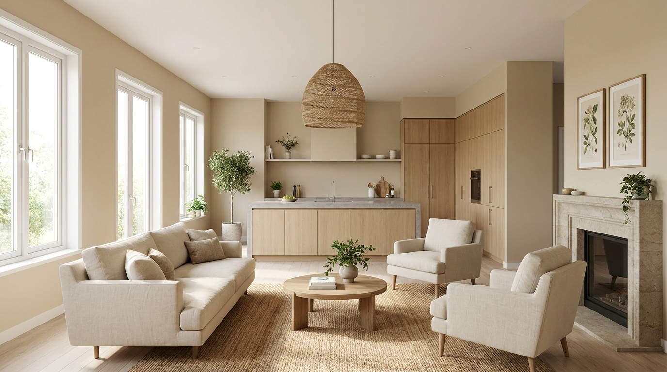
- 60% — Dominant color: This is your primary wall color, the tone that covers the majority of surfaces. In an open-plan home, this should ideally be consistent across zones (or closely related), creating visual continuity. Think: a warm linen white, a soft sage green, a muted greige.
- 30% — Secondary color: This brings depth and variation without disrupting flow. It might appear as an accent wall in one zone, cabinetry color in the kitchen, or a large area rug in the living space. This is where zones gain their individual character.
- 10% — Accent color: Small but mighty — pillows, artwork, pendant lights, ceramics, plants. This final layer adds personality and pop. In an open-plan home, repeating your accent color across zones ties everything together beautifully.
Quick Scenario: Imagine you have a combined kitchen-living-dining space. Your dominant 60% is a soft warm white (Benjamin Moore’s White Dove is a 2026 favorite). Your 30% secondary could be a dusty clay terracotta applied to the kitchen island and echoed in a linen sofa. Your 10% accent? A deep forest green in scatter cushions, a kitchen herb pot on the windowsill, and a framed botanical print above the dining table. The green appears in three zones — uniting them invisibly.
This approach is powerful because it gives you permission to have personality while ensuring the space never feels disjointed. The dominant color does the heavy lifting of cohesion; the secondary and accent layers do the work of interest and identity.
Flow Strategies: Creating Zones Without Walls
Color flow is the art of guiding the eye through an open-plan space in a way that feels natural and intentional. There are several proven strategies for achieving this:
Strategy 1: Tonal Progression
Choose a single color family and move through lighter and darker variations across zones. For example: a pale sage in the living area, a mid-tone sage-green in the dining zone, and a deeper forest note on the kitchen island. The eye reads continuity (it’s all green) but the brain recognizes distinct areas (each zone has a different depth). This is one of the most sophisticated and livable approaches in 2026 design.
Strategy 2: Warm-to-Cool Anchoring
Use warm tones in social, high-energy zones (kitchen, dining) and cooler tones in relaxation zones (living room, reading corner). Connect them with a neutral bridge — a warm white or soft greige that appears in both areas as trim, ceiling, or architectural detail. This technique respects the psychological function of each space while maintaining visual connection.
Strategy 3: Consistent Ceiling and Trim
One of the most powerful tricks in open-plan color design costs almost nothing extra: keep your ceiling and trim color identical throughout the entire space. When walls shift in tone or color across zones, a consistent ceiling and trim creates a unifying frame around the whole space. It’s the visual equivalent of a single bold picture frame around a multi-panel artwork.
Strategy 4: The Accent Wall Redirect
Rather than painting an entire zone a different color (which can feel abrupt), use a single accent wall to anchor and define a zone. A deep charcoal wall behind a sofa says “this is the TV and relaxation zone” without boxing it off. A terracotta-tinted wall behind a dining table creates warmth and intimacy in that corner. The rest of the space remains in the dominant color, so the transition is gentle rather than jarring.
Natural Light, Undertones, and the Big Mistakes to Avoid
No element of paint color is more misunderstood — or more impactful — than undertones. A white paint that looks crisp and clean in a store can turn distinctly pink, yellow, or green on your walls depending on your light conditions. In an open-plan home, where multiple light sources hit surfaces from different angles, undertone management is absolutely critical.
The Golden Rule: All colors in your open-plan palette should share compatible undertones. You can mix warm and cool tones intentionally (see Strategy 2 above), but you must do it consciously — not accidentally. Accidentally mixing a yellow-based white in the kitchen with a blue-based white in the living room creates a low-level visual discomfort that residents struggle to diagnose but feel every day.
How to Identify Undertones
Place paint swatches against a pure white background. The color that seems to “push through” the neutral is the undertone. Common undertones include pink, yellow, green, blue, and purple. Before committing to any palette, test at least two large (A4 or bigger) painted swatches in each zone of your home and observe them at different times of day — morning light, midday, evening artificial light. Colors behave dramatically differently across lighting conditions.
North vs. South Facing Rooms
In the Northern Hemisphere, north-facing spaces receive cooler, indirect light throughout the day. This amplifies cool and grey undertones and can make warm colors look muddy. South-facing spaces flood with warm, direct light that intensifies warm tones beautifully but can wash out delicate cool palettes. In large open-plan homes that span multiple orientations, you may need to subtly adjust your palette to account for how light changes across the floor plan.
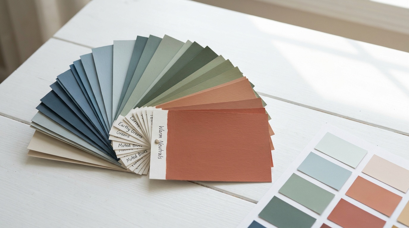
Top Color Palettes Trending in 2026
In 2026, the design world has moved decisively away from the stark all-white minimalism of the 2020–2023 period. Warmth, texture, and sophisticated earthiness define the most celebrated open-plan interiors this year. Here are the five dominant palette directions:
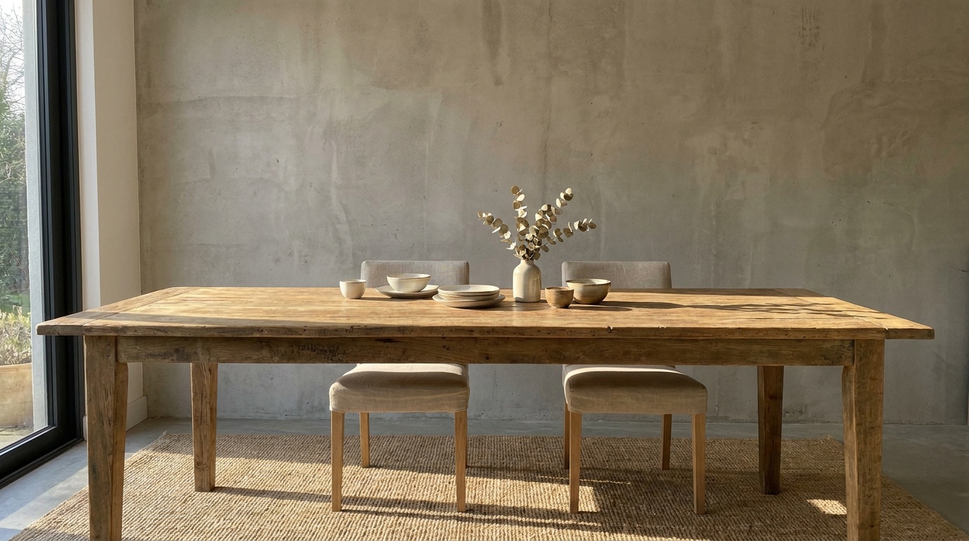
- Warm Stone and Warm White: Sandy beiges, warm off-whites, and putty tones anchor the majority of well-designed open spaces in 2026. Think Farrow & Ball’s Elephant’s Breath or Sherwin-Williams’ Accessible Beige as primary tones, layered with cream trims and deeper mushroom accents.
- Earthy Terracotta and Desert Tones: Inspired by Mediterranean and Southwestern aesthetics, these palettes use clay, rust, and warm amber as secondary and accent colors against neutral primaries. Perfect for creating warmth in dining and kitchen zones.
- Sage and Botanical Greens: Soft, muted greens continue their reign from 2024–2025 but have matured into deeper, more complex tones. Dusty sage, eucalyptus, and olive work beautifully in open-plan spaces because they read as nature-adjacent neutrals while still providing clear color identity.
- Warm Charcoal and Soft Black: Used strategically as secondary or accent colors, deep charcoal and near-black tones add drama and sophistication. In 2026, these appear frequently on kitchen islands, fireplace walls, and built-in shelving within open-plan spaces.
- Blue-Grey Coastal: A perennial favorite that has evolved from pale baby blues into richer slate, stormy blue-grey, and denim tones. Works exceptionally well in coastal homes and loft apartments where natural light is abundant.
Real Home Case Studies: What Worked and What Didn’t
Case Study 1: The Brooklyn Loft (Tonal Success Story)
In 2025, interior designer Marcus Webb completed a renovation of a 1,400-square-foot open-plan loft in Brooklyn. The challenge: a single enormous room serving as kitchen, dining, living, and workspace for a couple with a young child. The solution was a masterclass in tonal progression.
Webb chose a warm putty white (Dunn-Edwards’ Swiss Coffee) for approximately 70% of the surfaces — all walls, ceiling, and trim. The kitchen island was painted in a deep slate blue-grey, creating a strong visual anchor and separating the cooking zone immediately. A large vintage Berber rug in cream, rust, and deep brown defined the living area without needing any wall color change. The home office corner received a single wall in a muted forest green, signaling “focus space” without disrupting flow.
What made it work: All four accent colors (slate blue, rust, brown, forest green) were united by warm undertones. The neutral dominance (70%) gave the accents room to breathe without competing. The result was a space that felt curated, not chaotic.
Case Study 2: The London Terrace Conversion (A Cautionary Tale)
A homeowner in South London documented their 2024 open-plan renovation on social media, and it became an inadvertent lesson in what not to do. After knocking down the wall between their kitchen and living room, they painted the kitchen a bold cobalt blue (inspired by a Pinterest board) and kept the living room in an existing warm terracotta from a previous renovation.
The result was visually jarring — the cool cobalt and warm terracotta clashed dramatically when seen simultaneously from the central dining area. What looked beautiful in isolated Pinterest photos became oppressive in the connected reality of their home. They repainted the kitchen in an earthy teal — still bold and distinctive, but sharing warm undertones with the terracotta — and the space transformed instantly.
The lesson: Never evaluate colors in isolation. Always hold your swatches next to every adjacent color before committing. The shift from cobalt (cool undertone) to earthy teal (warm undertone) was subtle on paper but transformative in the space.
Case Study 3: The Scandinavian Apartment (The Neutral Done Right)
A Stockholm apartment photographed for Elle Decoration Nordic in early 2026 demonstrates how to create a sophisticated entirely-neutral open-plan palette without the space becoming boring. The designer used five different “whites” — ranging from bright optical white on the ceiling to a warm cream on the walls, a slightly greener off-white on built-in shelving, and a deep mushroom grey on the kitchen cabinetry. All whites shared the same yellow-warm undertone family.
The variety came entirely from finish and tone rather than hue. Matte walls absorbed light differently than gloss-finish cabinets. The result was a space of exceptional calm and visual intelligence — proof that neutral doesn’t mean uniform.
Palette Comparison: Which Style Suits Your Home?
| Palette Style | Best For | Light Requirement | Difficulty Level | 2026 Trend Score |
|---|---|---|---|---|
| Warm Stone & Whites | All home styles, families | Any orientation | Beginner-friendly | ⭐⭐⭐⭐⭐ |
| Earthy Terracotta | Mediterranean, eclectic homes | South/west-facing ideal | Intermediate | ⭐⭐⭐⭐ |
| Sage & Botanical Greens | Modern, Scandi, biophilic design | Bright, abundant light best | Intermediate | ⭐⭐⭐⭐⭐ |
| Warm Charcoal Accents | Industrial, contemporary lofts | High light required | Advanced | ⭐⭐⭐⭐ |
| Blue-Grey Coastal | Coastal, light-filled apartments | North/east-facing ideal | Beginner-friendly | ⭐⭐⭐ |
Designer Popularity Chart: 2026 Open-Plan Color Palette Preferences
Based on survey data from 847 interior designers polled by the Color Marketing Group in early 2026, here’s how palette preferences break down for open-plan residential projects:
2026 Designer Palette Preference (% of projects)
78%
64%
51%
43%
29%
Source: Color Marketing Group Designer Survey, Q1 2026 (n=847). Multiple selections permitted.
Frequently Asked Questions
Can I use more than one wall color in an open-plan space without it looking messy?
Absolutely — in fact, using a single wall color throughout can sometimes make a large open-plan space feel flat and undifferentiated. The key is ensuring all colors share the same undertone family (all warm, all cool, or deliberately balanced as described in Strategy 2). As a practical rule, limit yourself to three wall colors maximum: one dominant tone covering 60–70% of surfaces, and one or two secondary tones used as purposeful zone anchors. Test every combination together in natural light before committing, and ensure your ceiling and trim color remains constant throughout to provide visual continuity.
How do I choose between warm whites and cool whites for my open-plan space?
The answer depends almost entirely on your natural light conditions and the other materials in your space. If your home receives predominantly warm, south-facing light and features natural wood floors, rattan furniture, or warm metal accents (brass, copper, gold), warm whites with yellow or pink undertones will feel natural and cohesive. If your space is flooded with bright, neutral or cool light (north or east-facing), or features cool materials like polished concrete, stainless steel, or blue-toned stone, a cooler white with blue or grey undertones will harmonize better. The biggest mistake is choosing white based on how it looks in a store under fluorescent lighting — always, without exception, test paint swatches on your actual walls at multiple times of day.
My open-plan space has a kitchen, dining area, and living room — how do I differentiate them without using completely different colors?
This is the most common challenge in open-plan color design, and there are several elegant solutions. First, use the tonal progression strategy — the same color family in slightly different depths across each zone creates distinction while maintaining visual harmony. Second, lean on non-paint elements to do the differentiating work: a large area rug anchors the living zone, pendant lighting above the dining table defines that area, and kitchen cabinetry color naturally distinguishes the cooking zone. Third, consider using a single bold accent wall in each zone — each in a different but compatible color — while keeping all other walls in your consistent dominant tone. This approach uses color as a subtle signal rather than a bold separator, which is the hallmark of sophisticated open-plan design in 2026.
Your Color Confidence Roadmap: Next Steps
You now have the framework, the strategies, and the real-world evidence to make confident, beautiful color choices for your open-plan home. Let’s turn this knowledge into a clear action plan:
- Audit your light: Spend one full day observing how light moves through your space — morning, midday, and evening. Note which zones are warmest, which are coolest, and where the light is most flattering. This single step will save you from the most common and expensive color mistakes.
- Choose your undertone family: Decide whether your space calls for warm or cool undertones (or a deliberate combination), then commit to that decision across every color choice. Write it down. Refer to it when temptation strikes.
- Build your 60-30-10 palette: Select your dominant neutral, your secondary zone-defining color, and your repeating accent color. Test all three together in large swatches in your actual space before purchasing a single full can of paint.
- Apply your flow strategy: Choose one of the four flow strategies that best suits your space and personality (tonal progression, warm-to-cool anchoring, consistent ceiling/trim, or accent wall redirect), and apply it consistently.
- Start with the largest zone: Begin painting the most prominent, largest area of your open-plan space first. Once you see that color working in context, the decisions for adjacent zones become significantly easier and more confident.
Pro Tip: In 2026, the most celebrated open-plan interiors share one quality above all else: they look effortless. That effortlessness isn’t accidental — it’s the result of deliberate, patient color strategy executed with discipline. The homes that look like they “just came together naturally” are always the ones where someone made very intentional decisions about every square foot of color.
As biophilic design and nature-inspired living continue to dominate residential aesthetics through 2027 and beyond, the emphasis on warm, organic, earthy palettes in open-plan spaces will only deepen. The homeowners who understand how to use color strategically today are building homes that will feel timeless rather than dated in five years.
Here’s the question to carry with you: When you stand in the center of your open-plan space and look in every direction at once, does every color you see feel like it belongs to the same intentional story? If the answer isn’t an immediate yes — you now know exactly what to do about it.
Article reviewed by Tom Schuster, Roofing & Water Damage Rehabilitation Expert, on May 4, 2026